

Saw this on YouTube- Luv it!
![]()
![]() HEADLINE TOPICS
HEADLINE TOPICS
![]() SOULFUL DETROIT Forum
SOULFUL DETROIT Forum
![]() MOTOWN Forum
MOTOWN Forum
![]() CLUBHOUSE
CLUBHOUSE
![]() ALL FORUMS
ALL FORUMS
![]() Forum Archives
Forum Archives
![]() Soulful Detroit Tours
Soulful Detroit Tours
Results 1 to 7 of 7
-
03-11-2020, 07:33 PM #1
 Senior Member

- Join Date
- Jul 2017
- Posts
- 641
- Rep Power
- 104
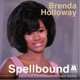
Brenda Holloway alternate cover photo
-
03-11-2020, 07:35 PM #2
Senior Member

- Join Date
- Aug 2010
- Posts
- 43,221
- Rep Power
- 601
That looks really nice! Originally Posted by luckyluckyme

-
03-12-2020, 01:16 AM #3
Senior Member
- Join Date
- Aug 2010
- Posts
- 583
- Rep Power
- 174
This shot is used for the digital release of the CD.
-
03-12-2020, 10:03 AM #4
Senior Member
- Join Date
- Sep 2019
- Posts
- 962
- Rep Power
- 95
That's a great album cover. If I had to make one small little change is I would swap out the Motown label for the Tamla label.
-
03-13-2020, 06:33 AM #5
Senior Member

- Join Date
- Aug 2010
- Posts
- 2,750
- Rep Power
- 212
And I'd change the type font. Makes it look like a bootleg Originally Posted by SatansBlues
-
03-13-2020, 11:26 PM #6
Senior Member
- Join Date
- May 2018
- Posts
- 1,580
- Rep Power
- 212
That's the unfortunate thing about graphic arts in recent years; if you don't do it right, it ends up making your product look like it's from Bootleg City. I get the direction aimed for with the simple typeface- a clean, sreamlined look- but you really have to get the perfect typeface or it just ends up looking like something swiped from the old home computer font package. I'm also not a fan of how the Big M Motown logo looks these days. Having the "M" as a solid instead of the classic "stencil" type makes it look like a cheap knockoff. Originally Posted by soulwally
-
03-16-2020, 08:33 PM #7
Senior Member
- Join Date
- Sep 2016
- Posts
- 6,825
- Rep Power
- 258
Good to see this album [[and other such collections) released digitally as well. The digital album cover for the Artistry of Brenda Holloway [[the ACE CD) is pretty good I think. I assume its all legit? Originally Posted by booty

 Reply With Quote
 Posting Permissions

Soulful Detroit Navigation
SoulfulDetroit Management
SoulfulDetroit Affiliates
© AtDetroit LLC All Rights Reserved - unless otherwise specified. Please notify us of uncited proprietary content.
Bookmarks