


I've always loved graphic design- all the elements including typeface, font, typography, logos and such. I honestly think when I started collecting Motown albums in junior high school, the interest intensified. I'd spend hours looking at the Motown album covers- the photography, typeface used for the titles and the various Motown label logos. One thing that stood out to me was how Motown seemed to keep tweaking the "MOTOWN" box logo. Not the early versions, but the one that began in 1965.
From the "Both Sides Now" site, it would seem the first album to feature the newly redesigned Motown Box logo was the eponymously-titled album, "Four Tops." But this gets tricky as Motown sometimes was withholding albums and not always releasing them sequentially. From everything I can tell, however, the Tops' LP, #622, would have come out in 1964, between the Supremes' "Where Did Our Love Go" and "The Supremes A Bit Of Liverpool" albums- both of which feature the horizontal, rectangular Motown logo. But being that it came out January 21, 1965, it would seem to make it the first LP to receive the new-look Motown box logo.
This Motown box logo, though, was a rather slim box, a vertical, rectangular box. Then, in 1966, there was yet another Motown box logo introduced, this time a square box. This one was unveiled with MT/MS-654, "Four Tops Live", released November 16, 1966. Again, this is a case where Motown wasn't always releasing their albums sequentially- for example, the album, "The Supremes Sing Holland-Dozier-Holland" is MT/MS 650, which would have been immediately after "The Supremes A Go-Go", but in fact, wasn't released until the next year, 1967.
What's interesting about both of these versions of the Motown logo is that they feature the "MOTOWN" name with two horizontal bars, one above and one below the name. But then, suddenly, the horizontal bar above the "MOTOWN" was eliminated. This change happened between the "Four Tops Reach Out" album [[#660 July 17, 1967) and the "The Motown Sound A Collection Of 16 Big Hits Volume 7" [[#661 August 29, 1967) Seems like such a small change. Was it done for the sake of clarity, to make the "MOTOWN" text more easily readable? Or maybe for the sake of increased clarity when the logo was printed out in smaller formats.
None of this is really important, lol, but these are the types of things that really interest me about graphic design. [ I did this kind of quickly so some of the album covers aren't as clear as I'd like, but you can get the general idea of the changing logos)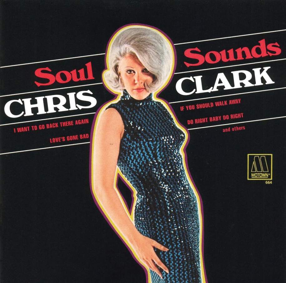
![]()
![]() HEADLINE TOPICS
HEADLINE TOPICS
![]() SOULFUL DETROIT Forum
SOULFUL DETROIT Forum
![]() MOTOWN Forum
MOTOWN Forum
![]() CLUBHOUSE
CLUBHOUSE
![]() ALL FORUMS
ALL FORUMS
![]() Forum Archives
Forum Archives
![]() Soulful Detroit Tours
Soulful Detroit Tours
Results 1 to 39 of 39
Threaded View
-
11-24-2022, 02:29 AM #1
 Senior Member

- Join Date
- May 2018
- Posts
- 1,580
- Rep Power
- 211
Motown Graphic Design: The Motown Box Logo
Last edited by WaitingWatchingLookingForAChance; 11-24-2022 at 02:32 AM.

 Reply With Quote
 Posting Permissions

Soulful Detroit Navigation
SoulfulDetroit Management
SoulfulDetroit Affiliates
© AtDetroit LLC All Rights Reserved - unless otherwise specified. Please notify us of uncited proprietary content.
Bookmarks