

just thinking out loud
for the most part i like the original motown covers but a few,.well i cant believe they got released.
i found the cover art to We Remember Sam lackluster.
the Copa,omg, showcasing Dianas big wig. hate this cover more than any other.
Let The Sunshine In ,well the cover and album should have been canned.dreadful.
some favs
love child
reflections
meet the supremes blue cover
sing hdh
![]()
![]() HEADLINE TOPICS
HEADLINE TOPICS
![]() SOULFUL DETROIT Forum
SOULFUL DETROIT Forum
![]() MOTOWN Forum
MOTOWN Forum
![]() CLUBHOUSE
CLUBHOUSE
![]() ALL FORUMS
ALL FORUMS
![]() Forum Archives
Forum Archives
![]() Soulful Detroit Tours
Soulful Detroit Tours
Results 1 to 50 of 53
Thread: supremes album covers
-
08-29-2022, 07:12 PM #1
 Senior Member

- Join Date
- Aug 2010
- Posts
- 3,107
- Rep Power
- 239
supremes album covers
-
08-29-2022, 09:05 PM #2
Senior Member
- Join Date
- Jul 2011
- Posts
- 548
- Rep Power
- 191
 Originally Posted by daviddh

My favorites of the sixties covers:
Greatest Hits
Talk Of The Town
I Hear A Symphony
Holland Dozier Holland
Love Child
And the What Were They Thinking Award goes to:
Greatest Hits Vol. 3
-
08-29-2022, 10:29 PM #3
 Senior Member


- Join Date
- Aug 2010
- Posts
- 8,823
- Rep Power
- 396
i think the Copa works. is it the best one ever? no but i think they really wanted a pic of opening night since it was such an event. and the hats and canes were right in line with their act. it also might have been a matter of finding a pic that someone didn't have their eyes closed or looked weird, while also still looking exciting and energetic.
i sort of like the original MTS cover just because it's very of it's time. that funky font and typeface just makes me smile and think 60s.
WDOLG - one of their best. the minimalism is so effective. it's just class personified.
More Hits - great since it includes their names/autographs. only change would be to have either F or M looking outwards. they both appear to be looking lovingly and longingly at Diana. of course that could have been part of the plan
CW&P - not all that great. pretty cheesy
Liverpool - not too bad. frankly better than the music it contained lol
Sam Cook - useless. for as glamorous and exciting as the girls are, this is a real cop out. especially since this was early in the career and they would have wanted to continue to establish the group's look
Symphony - beautiful
A Go Go - love it
Sing HDH - eh. ok but nothing special. the pic is too old and out of date
R&H - fine except for the out dated pic
GH - beautiful
Reflections - love
TOTT - amazing. such a perfect high-glam action shot
LC - not a fan. it's too contrived and costume. like a scene from a poorly written stage play. i like the idea to go contemporary, no sequins. and even limited the glamour look. but this is too much
Sunshine - i don't have the drawings but i hate the color palette. so muted and blah. if you're doing with psychedelic designs, then go for it! they should have hired Peter Max and commissioned a cover art design from him
TCB - great
Join the temps - fine
Broadway - fine
Together - meh
Cream of the crop - not opposed to the idea of a standalone image for Diana but this is wAAYYYY too close up
GH3 - worthless
Farewell - not a fan. i know they're trying to go super classy but the image looks as though it was taken from outer space, it's so far away
-
08-30-2022, 02:17 AM #4
Senior Member
- Join Date
- May 2018
- Posts
- 1,579
- Rep Power
- 211
Just a thought about the Sam Cooke album cover. I didn't live through the era but I've seen enough album covers from the 60s in thrift shops to know that those line art/illustration covers were very much in vouge with MOR artists. When I first saw the Supremes Sam Cooke cover, my immediate thought was that Motown wanted the parents to look at that album and think Andy Williams, Peggy Lee, Nat King Cole...THE SUPREMES! Look kids! Your old mom and dad bought some of your music! I thought the cover was just fine. Of course, stuff could always be done better, but as I learned from an interview with Bernard Yeszin, he and the others in Motown's art department were still learning and basically learning on the job in those earlier years.
-
08-30-2022, 08:30 AM #5
Senior Member
- Join Date
- Aug 2010
- Posts
- 9,299
- Rep Power
- 519
I can't think of a Supremes album cover I truly dislike except for GREATEST HITS VOL.3. Such a lack of imagination and even worse, to repeat the bland cover on the rear as well. The group did so many photo sessions that a great cover shouldn't have even been a concern.
I actually like the Sam Cooke album cover, particularly the feel of the material. I think it looks rather classy.
I also like the LOVE CHILD cover. It would be nice to see outtakes from that photo session. Perhaps when the Expanded Edition comes out.
-
08-30-2022, 09:39 AM #6
Senior Member
- Join Date
- Aug 2016
- Posts
- 3,947
- Rep Power
- 397
My favorite.
Next favorite.

-
08-30-2022, 10:03 AM #7
Senior Member
- Join Date
- Aug 2010
- Posts
- 2,669
- Rep Power
- 245
I think the UK Supremes Sing Motown cover is rather nice in comparison to the US Supremes Sing HDH cover.
-
08-30-2022, 10:38 AM #8
Senior Member
- Join Date
- Aug 2010
- Posts
- 3,107
- Rep Power
- 239
Love that UK lp cover.
Beautiful
-
08-30-2022, 11:17 AM #9
Senior Member
- Join Date
- Aug 2010
- Posts
- 9,299
- Rep Power
- 519
There was also a version of this album with a slightly different pose than the one shown above.
Last edited by reese; 08-30-2022 at 11:23 AM.
-
08-30-2022, 11:24 AM #10
Senior Member
- Join Date
- Jun 2018
- Posts
- 1,250
- Rep Power
- 164
Favorites:
WDOLG - beautiful
More Hits - our girls had arrived! Plus, loved the liner notes and pics on back
HDH - the girls know they’re supreme!
GH 1&2 - stunningly gorgeous & classy - probably my very favorite
Love Child
Touch
Floy Joy
High Energy - would have been great if there had been a reason for GH 4 ☹️
Dislikes:
COTC - the up close pic was unnecessary
GH3 - the worst & laziest cover
-
08-30-2022, 12:56 PM #11
Senior Member
- Join Date
- Aug 2010
- Posts
- 2,669
- Rep Power
- 245
I agree daviddh, it portrays the supreme nature of the group so well. I find the false assertive look on the US version unattractive. However, it might be a cultural difference as the assertive look might have been relevant in the US in a way that it wasn't in the UK. Originally Posted by daviddh
Last edited by rovereab; 08-30-2022 at 01:31 PM.
-
08-30-2022, 01:31 PM #12
Senior Member
- Join Date
- Aug 2010
- Posts
- 4,297
- Rep Power
- 360
One of the rejected designs for Sing Holland-Dozier-Holland was the live shot of the girls with their arms in the air that was featured on the back of the Sing Rodgers & Hart album.
The sketches and liner notes used on the Greatest Hits collection were originally part of the designs for the abandoned From Broadway To Hollywood album.
The cover for the Theres A Place For Us album was almost identical to what would later be used on I Hear A Symphony - same photo and all. The only difference was the font and title.
-
08-30-2022, 03:37 PM #13
Senior Member
- Join Date
- Aug 2010
- Posts
- 8,823
- Rep Power
- 396
here's an idea for Sing HDH [[especially since some of the record buyers might not have understood who/what "HDH" stood for)
the casual photo of the girls on the back cover with HDH - could one of the images from this series of photos been used? maybe a posed shot of the girls in the recording studio with the 3 guys coaching and rehearsing them? make the cover almost a "working" photo.
i realize they had just done the groovy, casual A Go Go cover so they probably wanted to return to something more glamorous
-
08-30-2022, 03:39 PM #14
Senior Member
- Join Date
- Aug 2010
- Posts
- 8,823
- Rep Power
- 396
what about for Right On?
in Feb the girls performed on Sullivan in the new red pantsuits. I've since seen 2 photos of them from a photo shoot wearing these. there is the small pic eventually used on NW of them dancing and then another shot standing together which was used for lobby cards/posters and has more recently been used in some rereleases and compilations.
so you have a fresh pic of the girls in their latest outfits - why not use for the launch lp?
-
08-30-2022, 05:25 PM #15
Senior Member
- Join Date
- Mar 2017
- Posts
- 8,692
- Rep Power
- 535
I prefer this cover to the alternate shot Rovereab posted. Originally Posted by reese
I love this shoot, but if you don't pay too close attention, it looks like either Flo is sitting on Diana's lap, or Diana is sitting on Flo's lap. Either way, it's a beautiful photograph and definitely deserved of a cover.
-
08-30-2022, 05:34 PM #16
Senior Member
- Join Date
- Mar 2017
- Posts
- 8,692
- Rep Power
- 535
I'm not wildly impressed with most of the Supremes' album covers. Supremes 75 is absolutely beautiful. Floy Joy is very contemporary. The Touch cover would have been gorgeous if the girls had been in color.
I love the photo used for HDH but Motown really should have gone with something more current. All the great photo shoots the ladies had done in the last six months and the art dept goes for a 1965 pic? Lazy. But if I set that criticism aside, it is a great cover.
Love Child is brilliant, although I think it's stupid that only Diana has a LC sweater on. Actually I think the sweater is stupid and cheesy. But the cover is a great shot of the girls, and the only other alternate I've seen is also great. Definitely fits the "dark" tones of the album.
I don't care for the Symphony cover either. The ladies did one of my favorite photo sessions of them that fall. I'd prefer one of those over the photo that actually made it.
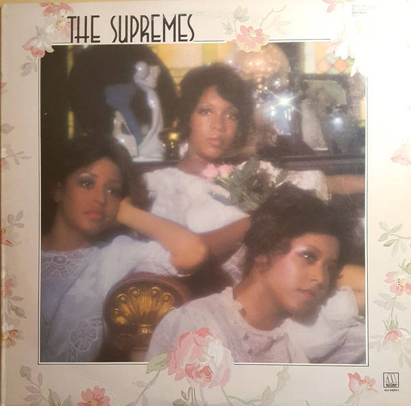
The original Meet the Supremes album cover is nice, for what it is. I've always wondered if the ladies took individual photos or if they were posed together for one photo that was eventually cut into three for the cover.
-
08-30-2022, 05:36 PM #17
Senior Member
- Join Date
- Mar 2017
- Posts
- 8,692
- Rep Power
- 535
The picture sleeves for 45s got a lot of great pics, often times much better than the album covers, IMO.
-
08-30-2022, 06:14 PM #18
Senior Member
- Join Date
- Aug 2010
- Posts
- 3,107
- Rep Power
- 239
love the 45 pix sleeve for WDOLG single
-
08-30-2022, 07:52 PM #19
Senior Member
- Join Date
- Apr 2021
- Posts
- 1,229
- Rep Power
- 158
Hands down it's the Mary Scherrie and Susaye album cover that's my favorite. What a dramatic and powerful image of the ladies. Back cover is quite good as well.
-
08-30-2022, 09:30 PM #20
Senior Member
- Join Date
- Aug 2010
- Posts
- 8,823
- Rep Power
- 396
agreed! the artwork for MS&S is top notch. it's one of my favs too. both the art and the music Originally Posted by Spreadinglove21
-
08-31-2022, 01:55 PM #21
Senior Member
- Join Date
- Apr 2011
- Posts
- 2,128
- Rep Power
- 261
My five favs are:
More Hits
A Go-Go
Right On
Mary, Scherrie & Susaye
Reflections
Least favs
Jimmy Webb - just a POS cover. Even the thin white lettering is washed out
GH 3
At Their Best
1975 The Supremes, pic is blurry, white virginal dresses out dated
Let The Sunshine In
-
08-31-2022, 08:03 PM #22
Senior Member
- Join Date
- Aug 2010
- Posts
- 6,874
- Rep Power
- 396
I love the Supremes 75 cover, but Cindy is almost unrecognizable.
-
09-01-2022, 04:59 AM #23
Senior Member
- Join Date
- Mar 2013
- Posts
- 5,009
- Rep Power
- 389
Most of those album covers being now iconic.
The only thing i personally would change is having the group shot of the three woman as the main pic on Cream Of The Crop.
One might argue that this being virtually a Diana Ross solo album, she more then deserved her head so prominently featured. I just find that rather lovely pic of the three group members far more pleasing to the eye.
-
09-01-2022, 07:01 AM #24
Senior Member
- Join Date
- Aug 2010
- Posts
- 1,274
- Rep Power
- 268
My favorite: More Hits... They depicted the perfect image of 'the girls next door' who made it big.
My least favorite: Cream of the Crop... This cover was way too harsh. Although this was the late 60s/early 70s, Diana's look did not, in my opinion, flatter her beauty in any way. Having her superimposed up front was a negative in my book. When I look at the cover, I get a 'cold' feeling.
-
09-01-2022, 07:49 AM #25
Senior Member
- Join Date
- Mar 2013
- Posts
- 5,009
- Rep Power
- 389
I know exactly what you mean. It sends a chill right down my spine like someone walking over your grave. Originally Posted by jobucats

-
09-01-2022, 07:59 AM #26
Senior Member
- Join Date
- Aug 2010
- Posts
- 1,274
- Rep Power
- 268
Ollie9...I was about to use the word 'scary' in my description. The makeup, the pose, and the lighting make this beautiful woman actually look spooky. [[in my opinion) Originally Posted by Ollie9
-
09-01-2022, 09:06 AM #27
Senior Member
- Join Date
- Aug 2010
- Posts
- 6,874
- Rep Power
- 396
The makeup, especially the liquid eyeliner, is horrid. Originally Posted by jobucats
-
09-01-2022, 09:52 AM #28
Senior Member
- Join Date
- Aug 2010
- Posts
- 8,823
- Rep Power
- 396
i don't necessarily disagree with the idea of Diana being more prominently featured on that album art. on TCB cover art, she's in both pics on front [[plus more representation inside the gatefold), on Join her cartoon head is larger and a unique color to the others, Sunshine she's stand-alone. Originally Posted by Ollie9
so it's not about the separate image but good god - this is such as close up you could just about crawl into one of her pores. it's the execution i find disturbing.
-
09-01-2022, 09:54 AM #29
Senior Member
- Join Date
- Aug 2010
- Posts
- 8,823
- Rep Power
- 396
hahaha exactly, someone should have retouched it so that the eyeliner meets up properly at the corner of her eye Originally Posted by marybrewster
-
09-01-2022, 10:18 AM #30
Senior Member
- Join Date
- Aug 2010
- Posts
- 1,274
- Rep Power
- 268
Hey, marybrewster. Let's also talk about that picture on the back. And that's supposed to be Cindy on the left??? Originally Posted by marybrewster
-
09-01-2022, 10:18 AM #31
Senior Member
- Join Date
- Mar 2013
- Posts
- 5,009
- Rep Power
- 389
The message it conveys couldn’t possibly be least subtle. Originally Posted by sup_fan
-
09-01-2022, 11:09 AM #32
Senior Member
- Join Date
- Aug 2010
- Posts
- 8,823
- Rep Power
- 396
haha she almost looks asian Originally Posted by jobucats
-
09-01-2022, 03:38 PM #33
Senior Member
- Join Date
- Mar 2013
- Posts
- 5,009
- Rep Power
- 389
It’s certainly not a pic you would want hanging from the wall facing your bed lol. Originally Posted by jobucats
-
09-01-2022, 04:26 PM #34
Senior Member
- Join Date
- Aug 2010
- Posts
- 8,823
- Rep Power
- 396
yeah i can't imagine many fans pinning Cream Of The Crop album cover up on their wall! haha imagine waking up in the middle of the night and the moon hitting the cover just right so it looks like Diana's disembodied head is float and staring right at ya!! lol Originally Posted by Ollie9
-
09-01-2022, 04:28 PM #35
Senior Member
- Join Date
- Apr 2021
- Posts
- 1,229
- Rep Power
- 158
Although Mary got her chance for a Diana Ross Cream of the crop album cover pic on High Energy, albeit on the back cover. The worse pic on that back cover is the one on the top left. Looks like a promo pic posted outside a casino lounge promoting the free show in the lounge.
-
09-01-2022, 04:30 PM #36
Senior Member
- Join Date
- Aug 2010
- Posts
- 8,823
- Rep Power
- 396
i considered starting this as a new topic but figured it would work here too
what about the non-front cover art? back graphics, posters and tear aways, die cuts and gatefolds?
seems like many of the 60s really paid little attention to these, whereas the 70s did more so
Top non-front art
NW - only referring here to the back cover [[see below) as it's a fab pic of the afros session
more hits
tcb
Jimmy Webb - finally this album gets SOMETHING right. the pics of the group working with JW make an excellent addition to the package.
MS&S
worse non-front art
NW - what was the point of the gatefold???? they wasted all that inside space
GH3 and Dynamite
HE - here was have mary's giant head, although not nearly as bad as Cream
-
09-01-2022, 04:43 PM #37
Senior Member
- Join Date
- Apr 2021
- Posts
- 1,229
- Rep Power
- 158
For everyone's viewing pleasure:
-
09-01-2022, 05:30 PM #38
Senior Member
- Join Date
- Mar 2013
- Posts
- 5,009
- Rep Power
- 389
LOL. The stuff of nightmares. I shall try now and erase all thoughts as i make ready to slumber... Originally Posted by sup_fan
-
09-01-2022, 05:32 PM #39
Senior Member
- Join Date
- Mar 2013
- Posts
- 5,009
- Rep Power
- 389
The Hills Have Eyes. Originally Posted by Spreadinglove21
-
09-01-2022, 05:36 PM #40
Senior Member
- Join Date
- Aug 2010
- Posts
- 8,823
- Rep Power
- 396
see i like the 3 group shots. but the Mary head is distracting. not as creepy as the Mega-Diana head. but still not a good use of the back cover art. Originally Posted by Spreadinglove21
what i don't like about the overall design is the lack of imagination. three random group images floating around Mary. just not very inspired
-
09-01-2022, 09:04 PM #41
Senior Member
- Join Date
- Nov 2010
- Posts
- 4,300
- Rep Power
- 334
I agree with this analysis. Though it was a few years later, Frank Sinatra's "That's Life" album and many others used similar line drawing portraits. As you say, I believe it was to aim the product at a more "mainstream" [[which in those days I guess meant white) audience. I like the cover; I think it does transcend its genre and still looks good today. Originally Posted by WaitingWatchingLookingForAChance
On another topic, I never liked the "Cream of the Crop" cover but I never thought it was creepy...until now, that is! The uber-close up does sort of evoke the Children of the Corn or something like that!
-
09-01-2022, 09:15 PM #42
Senior Member
- Join Date
- Mar 2012
- Posts
- 4,733
- Rep Power
- 316
It looks like it is choosing “Diana Ross [as the] Cream Of The Crop [The Supremes]”
Last edited by Boogiedown; 09-01-2022 at 09:18 PM.
-
09-01-2022, 09:24 PM #43
Senior Member
- Join Date
- Nov 2010
- Posts
- 4,300
- Rep Power
- 334
She wore that same hat at Florence's funeral. Originally Posted by sup_fan
-
09-01-2022, 09:29 PM #44
Senior Member
- Join Date
- Nov 2010
- Posts
- 4,300
- Rep Power
- 334
Or the album should be by Diana Ross and Diana Ross and the Supremes! Originally Posted by Boogiedown
-
09-01-2022, 10:20 PM #45
Senior Member
- Join Date
- Aug 2010
- Posts
- 6,874
- Rep Power
- 396
I think what would make an interesting thread is how some back cover art differs for the same album. I can't think of the LP off the top of my head, but one has an "artist sketch" of the Supremes singing live; other versions of the LP have a different back cover. Originally Posted by sup_fan
-
09-01-2022, 10:22 PM #46
Senior Member
- Join Date
- Jun 2018
- Posts
- 1,250
- Rep Power
- 164
LOL. This is true! Originally Posted by kenneth
-
09-01-2022, 10:23 PM #47
Senior Member
- Join Date
- Aug 2010
- Posts
- 6,874
- Rep Power
- 396
AT THE COPA has two different backs Originally Posted by marybrewster
-
09-01-2022, 10:33 PM #48
Senior Member
- Join Date
- Aug 2010
- Posts
- 9,299
- Rep Power
- 519
So does the Rodgers and hart album: two different performance photos. Originally Posted by marybrewster
-
09-02-2022, 06:35 AM #49
Senior Member
- Join Date
- Jul 2012
- Posts
- 678
- Rep Power
- 204
Two different international Greatest Hits covers. The first one -- Europe, 1967 -- is absolutely stunning; the second one -- Canada, 1978 -- "interesting"!
-
09-02-2022, 08:31 AM #50
Senior Member
- Join Date
- Aug 2010
- Posts
- 822
- Rep Power
- 263
I think Mary, Scherrie and Susaye has a stunningly beautiful photo on the cover and the High Energy illustration is great,Floy Joy looked contemporary while maintaining sophistication and the Right On cover had a strong photo. On the other hand, The gatefold mess on New ways [[and Mag 7) is a mess, Touch being in black and white looks cheap for that era and Jimmy Webb with that awful brown color with a dandelion all washed out on the front was clearly just so forgettable and unattractive.

 Reply With Quote
 Posting Permissions

Soulful Detroit Navigation
SoulfulDetroit Management
SoulfulDetroit Affiliates
© AtDetroit LLC All Rights Reserved - unless otherwise specified. Please notify us of uncited proprietary content.
Bookmarks