

The cover on my original pressing of Supremes A' Go Go has a fairly pale pink background and the type is green. All subsequent issues of the album featured a more intense pink background with blue type. Can anyone explain the reasoning behind this change? Both are attractive, but I tend to prefer the first one.
![]()
![]() HEADLINE TOPICS
HEADLINE TOPICS
![]() SOULFUL DETROIT Forum
SOULFUL DETROIT Forum
![]() MOTOWN Forum
MOTOWN Forum
![]() CLUBHOUSE
CLUBHOUSE
![]() ALL FORUMS
ALL FORUMS
![]() Forum Archives
Forum Archives
![]() Soulful Detroit Tours
Soulful Detroit Tours
Results 1 to 28 of 28
Thread: Go-Go Color Change?
-
03-16-2017, 10:00 AM #1
 Senior Member

- Join Date
- Jan 2012
- Posts
- 839
- Rep Power
- 158
Go-Go Color Change?
-
03-16-2017, 10:41 AM #2
Senior Member


- Join Date
- Aug 2010
- Posts
- 1,867
- Rep Power
- 228
I questioned that myself. I have the Green Go Go cover framed in my office. I asked Andy if the Expanded edition will feature the blue or the green but he just smiled at me and never answered!
-
03-16-2017, 10:49 AM #3
Senior Member
- Join Date
- Jul 2011
- Posts
- 3,998
- Rep Power
- 464
Never knew about the 'color change' on Supremes A Go-Go before so I don't know why it was done. However, Motown has done this with other albums in their catalog. Two examples; Originally Posted by BigAl

-
03-16-2017, 09:04 PM #4
Senior Member
- Join Date
- Aug 2010
- Posts
- 8,847
- Rep Power
- 397
My understanding is that change was done to improve legibility. Think of displays in a store or store window. The more vivid colors will show up better and from a distance too
-
03-16-2017, 09:45 PM #5
Senior Member
- Join Date
- Aug 2010
- Posts
- 3,996
- Rep Power
- 352
How it looked in Australia....
-
03-18-2017, 03:43 PM #6
Senior Member
- Join Date
- Jul 2011
- Posts
- 3,998
- Rep Power
- 464
That sounds like a good explanation. Here's another case where the cover for a Motown LP changed [[and the title was slightly changed also). Originally Posted by sup_fan
:format[[jpeg):mode_rgb[[):quality[[40)/discogs-images/R-6367101-1417481095-9039.jpeg.jpg)
:format[[jpeg):mode_rgb[[):quality[[40)/discogs-images/R-2929332-1349200334-7968.jpeg.jpg)
-
03-18-2017, 04:56 PM #7
Senior Member
- Join Date
- Aug 2010
- Posts
- 216
- Rep Power
- 170
There were loads of albums where the cover sleeves were either replaced with new artwork or changed partially to reflect a recent hit on that particular artist, with the cover artwork unchanged and only the title altered, as in:
Smokey Robinson and The Miracles "Make It Happen" became "Tears Of A Clown", and The Originals "Green Grow The Lilacs" became "Baby I'm For Real".
In the following examples, not only was the title changed, but the cover artwork as well :
Marvin Gaye "In The Groove" became "I Heard It Through The Grapevine",
Four Tops "Now" became "MacArthur Park"
Jr. Walker and The All Stars "Gotta Hold On To This Feeling" became "What Does It Take"
In some cases the change was more subtle, for example;
Smokey Robinson and The Miracles "Special Occasion" where the group photo on the cover was doubled in size, but otherwise the cover remained unchanged.
The Various Artists album "Tamla Special No. 1" became "Tamla / Motown Special No. 1".
In the case of the Michael Jackson album "Ben" the cover artwork was doctored to completely remove the photo of the pet rat he was holding and his photo dropped to remove the drawings of rats that had featured at the bottom of the original.
Finally, to support sup_fans comment about this being done to enhance visual appeal from a distance, and hopefully boost sales by doing so, Jimmy Ruffin's first album "Sings Top Ten" originally featured a drab monochrome picture of the singer, but this was later replaced with a brightly colored one, which was more visually more appealing.
There are more examples I'm sure.
-
03-18-2017, 05:41 PM #8
Senior Member
- Join Date
- Sep 2011
- Posts
- 2,432
- Rep Power
- 178
I think that whichever cover is used [[unless it is a split screen with both or an alternate that was also considered but not used), the other will be included in the booklet. Originally Posted by thommg
-
03-18-2017, 08:37 PM #9
Senior Member
- Join Date
- Aug 2010
- Posts
- 1,965
- Rep Power
- 222
I always thought that the green cover highlighted Florence's outfit. The Motown logo, particularly, was most similar to the color of her blouse.
My original mono album is the green cover and a stereo album that I bought a few years later is blue.
I was in the record stores weekly, if not more, but I can't remember when I first noticed the color change, although it seemed almost immediate. I think, at the time, that I thought the mono album was released in green and the stereo album in blue.
-
03-18-2017, 10:32 PM #10
Senior Member
- Join Date
- Aug 2010
- Posts
- 1,473
- Rep Power
- 193
This is how the Taiwanese version looked. Notice they replaced Put Yourself In My Place for A Lover's Concerto.
-
03-19-2017, 01:12 AM #11huntergettingcaptured Guest
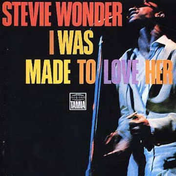
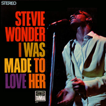
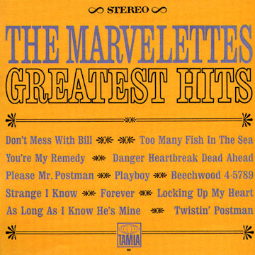
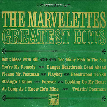
I do feel that the art department made that change in part because the green type against the pink background makes it just a bit harsh for the eye to focus- it's almost a "strobe" effect [[although I have to admit, I like like it). Same for the Marvelettes cover with the blue letters against an orange background- it's a little tricky for the eyes to take in, while green with yellow is easier on the eyes. [[I have both of those covers and again, I like that there are two!)
-
03-19-2017, 05:23 AM #12
Senior Member
- Join Date
- Feb 2012
- Posts
- 2,045
- Rep Power
- 214
I was told that when demand exceeded the projected pressing of an item, or the capacity for a certain plant, that other pressing and printing plants were put to use… Especially on the east and west coast to reduce shipping time and, On occasion, incorrect information might go out in the hurried actions of not running out of a hot item. Supremes a go go, in particular, was pointed out as an incorrect color separation of a rejected color option. This also occurred with the Rare Alternate cover of Everything Is Everythingand, the three alternate colors [[red, yellow and blue) of the Surrender album - although I doubt that it is because outrageously unexpected demand… Especially of Surrender. Yet, it is possible because Motown was very disappointed in the album sales for both Diana Ross, the new supremes, the four tops, Edwin Starr, David Ruffin and Martha Reeves and the Vandellas… And not wanting to get stuck with product just to flood the cut out bins, Motown was being very cautious with initial album orders.
-
03-19-2017, 10:59 AM #13
Senior Member
- Join Date
- Aug 2010
- Posts
- 1,965
- Rep Power
- 222
That is interesting that demand and additional pressings might be the reason for variations in album covers. Originally Posted by TheMotownManiac
Of course improving the appeal of an album cover makes sense. This is certainly true of Jimmy Ruffin's Top Ten album. The second cover, which is the one I have, would definitely catch the eye of a teenage record buyer. The first cover looked like something their parents would buy.
I liked the green A' Go-Go cover but I must admit the change to blue wasn't significant.
Everything Is Everything may have been changed for more than just the title graphics. The picture of Diana Ross had some modifications. The original cover showed a wisp of hair on her forehead, a shadow around her hip and wrinkles in her outfit on her abdomen. All these were corrected on the revised cover.
I have 3 back covers for EIE. In addition to the regular back cover, there is a negative of that cover and a third cover has an overexposed picture of Diana Ross.
Here is a link to discogs for the Denmark album [[although I think the pics are of the US cover but the Danish vinyl) that shows the first cover before corrections and the back cover negative:
https://www.discogs.com/Diana-Ross-E...elease/9324602
TheMotownManiac I'm confused about your comment regarding the Surrender album. I don't recall any variations for that album other than the UK title change to I'm Still Waiting. Could you clarify that comment, or were you referring to EIE album cover?
Well at least only The Marvelettes had an album that spelled their name incorrectly, as far as I know.Last edited by johnjeb; 03-19-2017 at 11:01 AM.
-
03-19-2017, 12:17 PM #14
Senior Member
- Join Date
- Dec 2010
- Posts
- 151
- Rep Power
- 164
Can anyone post the blue and green GO GO covers?
-
03-19-2017, 03:31 PM #15
Senior Member
- Join Date
- Sep 2011
- Posts
- 904
- Rep Power
- 185
They're in the first post. Originally Posted by biggestfourtops fan
-
03-19-2017, 04:34 PM #16
Senior Member
- Join Date
- Sep 2016
- Posts
- 6,825
- Rep Power
- 257
The images are "attached" and cannot be viewed in the mobile version of the forum! [[I learned this from experience Originally Posted by ejluther
 )
)
Here they are, inserted into this post:
Last edited by TomatoTom123; 03-19-2017 at 04:40 PM.
-
03-19-2017, 07:15 PM #17
Senior Member
- Join Date
- Oct 2012
- Posts
- 2,392
- Rep Power
- 280
Note that the color change is the same for stereo versions as well as mono. Originally Posted by TomatoTom123
-
03-19-2017, 07:40 PM #18
Senior Member
- Join Date
- Aug 2010
- Posts
- 1,965
- Rep Power
- 222
Yes, now I see. I probably knew that way back when but the memory isn't what it used to be. As I mentioned, I think the color change happened close to the original release date. Originally Posted by thanxal
Interesting in seeing that some covers do not have the white border framing the girls' pics. I never noticed this before. Both my green mono and blue stereo copies have the white border.
-
03-19-2017, 08:09 PM #19
Senior Member
- Join Date
- Oct 2012
- Posts
- 2,392
- Rep Power
- 280
It is amazing the memories that time fades. For instance, I remember being young. Someone told me it was a fun time!!! Originally Posted by johnjeb
-
03-19-2017, 09:51 PM #20
Senior Member
- Join Date
- Aug 2010
- Posts
- 8,847
- Rep Power
- 397
Having worked for decades in marketing I'm well aware of the Pantone Color Matching System. Each color is specifically identified by an exact recipe of inks. This allows designers to match then creative concepts to the printer's output.
These two A GoGo covers are extremely similar. The green and blue could frankly be just differences in print shops. This was a MASSIVE record and u can be sure Motown did everything to keep it in stores selling. If they went to alternative print shops there could have simple been discrepancies in the inks
-
03-19-2017, 11:42 PM #21
Senior Member
- Join Date
- Aug 2010
- Posts
- 4,007
- Rep Power
- 263
Sup Fan that would explain A Go Go
but it doesn't explain the two At The Copa LP's.
-
03-20-2017, 01:08 AM #22
Senior Member
- Join Date
- Dec 2010
- Posts
- 151
- Rep Power
- 164
All this talk of the different go go colors and unbeknownst to me I have both. I always buy albums of ones I may already have. For rarity or quality purposes. Never noticed the green go go for some reason. Thanks for making me look.
-
03-20-2017, 07:26 AM #23
Senior Member
- Join Date
- Aug 2010
- Posts
- 8,847
- Rep Power
- 397
I'm guessing the reason for two copa back covers was legibility. Didn't it first appear w the drawing and then later editions w/o?
-
03-20-2017, 08:49 AM #24
Senior Member
- Join Date
- Aug 2010
- Posts
- 4,007
- Rep Power
- 263
As far as "At The Copa", yes the drawing came first. I would always buy a Motown album and notice the cover or back changed so I would end up buying again.
"At The Copa" I prefer the drawing and as for " A Go Go" the green cover gets my vote.
-
03-20-2017, 12:35 PM #25
Senior Member
- Join Date
- Aug 2010
- Posts
- 8,847
- Rep Power
- 397
there are 2 different back cover art to Sing R&H too
-
03-20-2017, 01:50 PM #26
Senior Member
- Join Date
- Jan 2012
- Posts
- 839
- Rep Power
- 158
It also appeared to me that the type on the green/pink version was sharper and more hard-edged than that on the blue/pink version, which is a bit softer-edged. Changing cover art entirely for reissues or even second pressings is very common, but something as seemingly inconsequential as changing the the color of the type is more unusual.
-
03-20-2017, 03:45 PM #27
Senior Member
- Join Date
- Jan 2012
- Posts
- 839
- Rep Power
- 158
I also noticed a change on the back of the Reflections album.
Most of us are familiar with the fact that the originally planned front cover contained pix of Flo, which only seemed to appear on the thumbnail of the album displayed on singles sleeves of the time, never on any of the albums themselves. But, in addition, I noticed that the back cover on my copy had been applied over another back cover with differently formatted type in Diana Ross' liner notes. I painstakingly steamed off the second back cover to reveal the one underneath and found only very, very minor changes in the verbiage — nothing which changed the meaning at all. I still have to wonder about this.
-
03-21-2017, 09:23 AM #28
Senior Member
- Join Date
- Aug 2010
- Posts
- 4,007
- Rep Power
- 263
You know you are right !!!!! On the green/pink "A Go Go" the name SUPREMES seem more prominent than the blue cover too. I use to wonder if the second pressing was a mistake or that "A Go Go" was only originally sent to sell a specific number and they had to go back to press more.

 Reply With Quote
 Posting Permissions

Soulful Detroit Navigation
SoulfulDetroit Management
SoulfulDetroit Affiliates
© AtDetroit LLC All Rights Reserved - unless otherwise specified. Please notify us of uncited proprietary content.
Bookmarks